Laid Back Font - Pacifico & Tips on How To Use It
Hi there! My name is Hua. I am a designer and bootstrapping founder building Typogram, a brand design tool. As part of running Typogram, I create a weekly digestible visual guide about a new font with examples and case studies to help founders, creators, and makers step up their design game in branding and marketing.
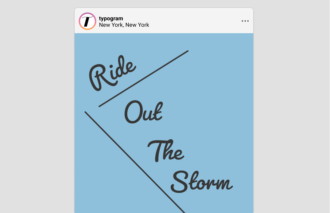
img: sample of Pacifico
Aloha, Pacifico!
The way our writings look is affected by the tool we use. Script lettering is an excellent example of this. The voice of a script font is very dependent on its writing instruments. For instance, a script written with a fountain pen appears formal, while a script written with a marker, ball-point pen, or brush appears casual.
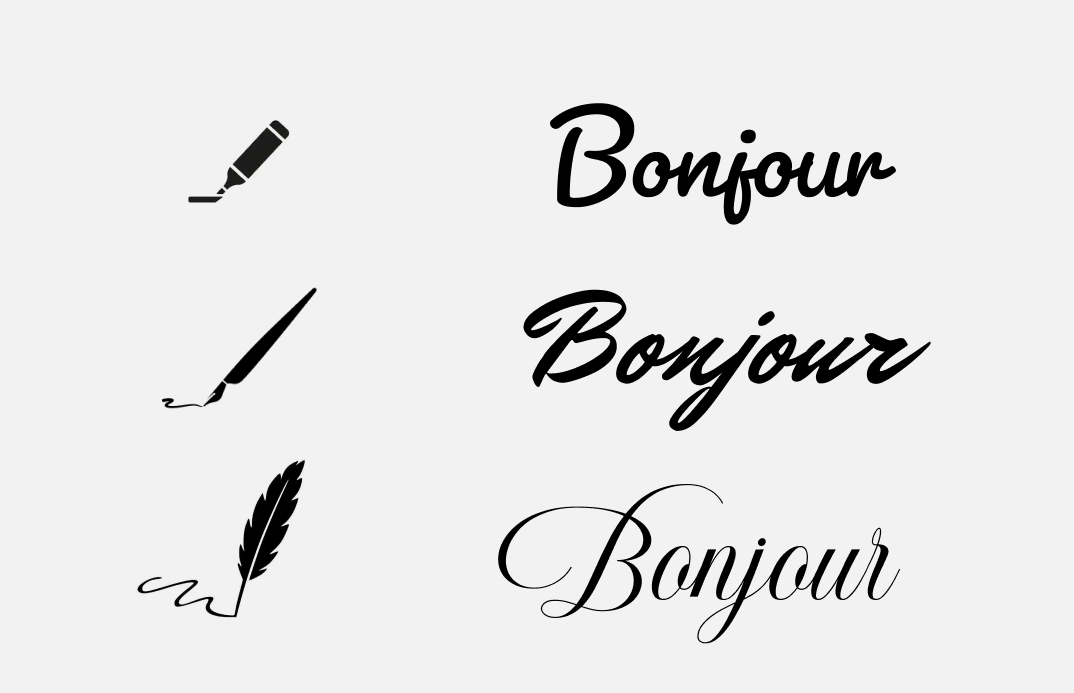
img: each tool results in a distinctive script.
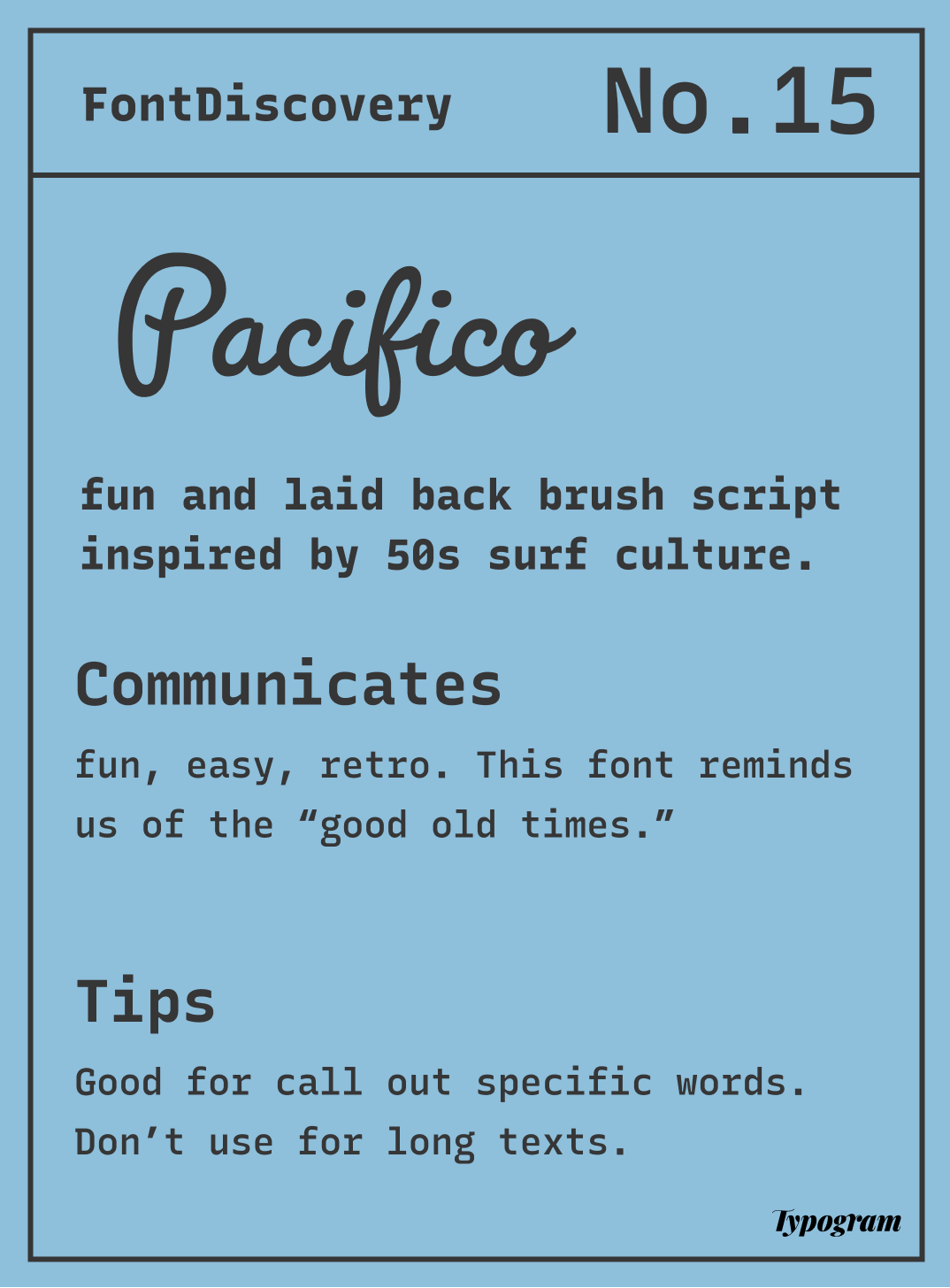
Scripts like Pacifico fall in the latter category and have enjoyed a rise in popularity in recent years. Pacifico was very popular in the 2010s and was updated in 2016 to include light and bold weights thanks to its popularity. It is a casual and fun brush script that takes inspiration from 1950s American surf culture. The roundness in the strokes makes this script popular among brands that want to appear laidback and fun. We feel at ease when we look at something that feels personalized, welcoming, and effortless. Pacifico also brings a sense of retro due to its inspiration from an earlier time.
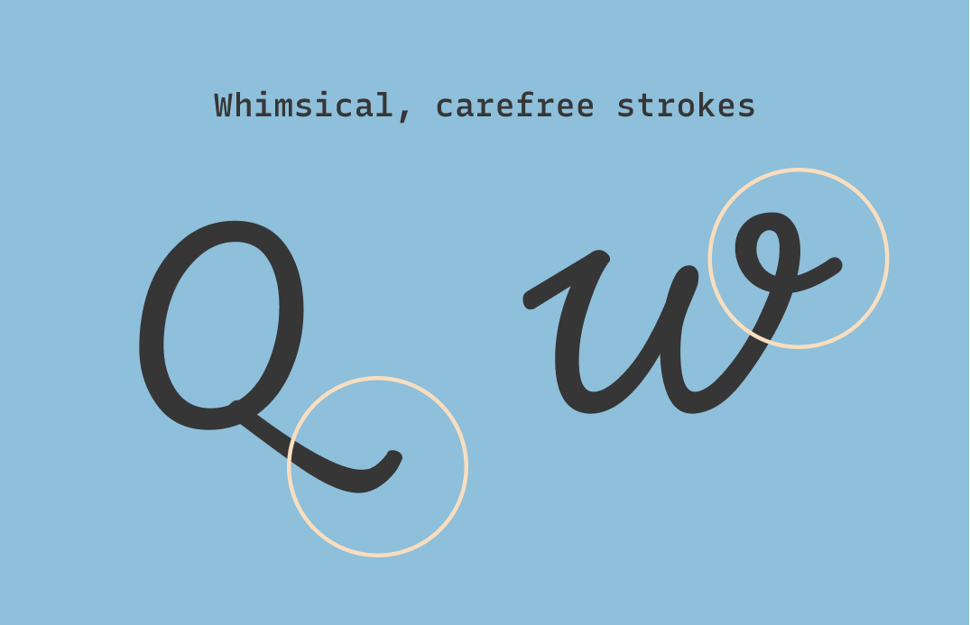
img: Pacifico’s strokes are drawn to illustrate its easiness.
Font Details
It's all about casualness. Pacifico has several uppercase letters drawn in lowercase form, to appear extra laidback. The round and exaggerated stroke also make us feel at ease.
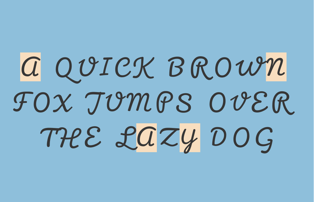
img: These are the uppercase letters of Pacifico. As you can see, a couple of the uppercase letter is actually lowercase. I outlined a few here.
How should I use it for branding?
This font communicates fun, easy, and retro. If your brand is looking to communicate these values to your audience, Pacifico could work for you. The light and regular are the most refreshing of the weights and can be great for logos. The bold is very thick and more suitable for statement-making items, like social media posts or packaging.
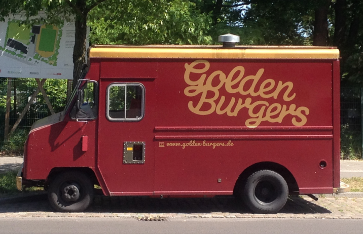
img: It is common to see brush lettering on food trucks like this one. source: fontsInUse
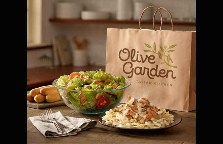
img: Olive Garden’s logo uses a font that is very similar to Pacifico.
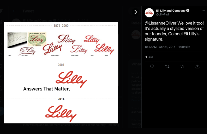
img: many brands use script lettering to appear personable, fun, and laidback. Drugmaker Eli Lilly uses a stylized version of the founder's signature. source: twitter;
How should I use it for marketing?
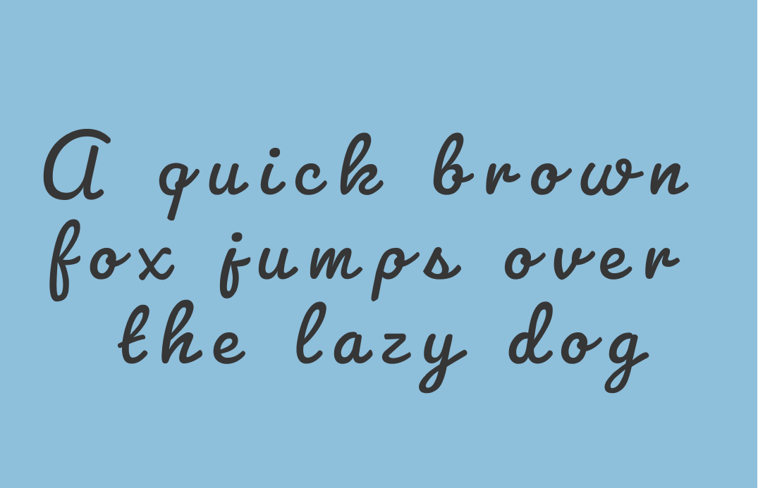
Pacifico is fantastic for big display text. It has a lot of character, so try using it sparingly. A good use case is when you have a few words you want to highlight on a marketing graphic. It is not best for longer pieces of text since it can be tough to read.
img: in longer texts, Pacifico is incredibly not user-friendly and hard to read.
Quick overview
⭢Font Details
-
Some uppercase letters are drawn in lowercase forms, like ‘a’ for ‘A’
-
Brushstrokes in uppercase letters are drawn to show a relaxed look
⭢ Logo & Branding
-
Perfect for brands that want to look laid back with a bit of retro
-
Good for making statements
⭢ Typography System
(marketing, presentation, and website)
Use sparingly
-
Do not use on long pieces of text
-
Best pair with a simple sans serif, like Roboto, Helvetica Neue
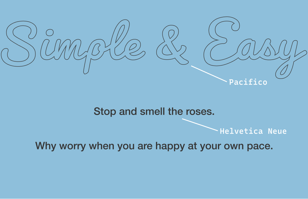
img: example paring of Pacifico and Helvetica Neue
Cautiously avoid
Avoid adding letter space between letters to completely “disconnect” a script.
img: it is not best practice to separate letters of scripts
Creative prompt
Try designing a Throwback Thursday post with Pacifico font on Twitter or Instagram!
Phew, you made it.
Pacifico is available here and here
You can use this font for free on adobe by making a free account (without buying a creative cloud membership).
img: summary of Pacifico in an infographic
I share tips like this every week at FontDiscovery. Subscribe here or on substack if you feel like. You can also read previous issues on Typogram's blog.
Have more questions about design and fonts? Please email me at [email protected] or find me on Twitter at @HuaTweets

Great insights! So much background info that a lot of us can use for branding.
thank you Meisuleen! 🥰 that means a lot!
Love that font! 😍 Great post Hua!
Thank you Solene! 😁
believe or not, wickedtemplates first shitty logo font was pacifico
https://www.producthunt.com/posts/wicked-templates
i will always like this font,...
Great post Hua!
it got no.5 product of day on PH!!!
Thanks Mike! 😁
You welcome!
Oh yeah...it was bad, I don't know how it happened.
I love Pacifico, there is another similar font Lobster (Google Fonts) I believe.
Though, my all-time favorite is Gotham such a versatile font family.
Great post, Hua.
thank you sodux! that means alot! Hoping to keep creating useful posts : )
Gotham is a very useful one!