Tailwind CSS tip: Make your site look great on any screen.

We all know that Tailwind CSS is a handy tool for making websites quickly and easily. It's great for making sure your site looks good on phones, tablets, and computers without a lot of hassle ( sometimes ). In this post, we're focusing on some cool new utility classes that help you control how tall things are on your site, making sure they look perfect on any device.
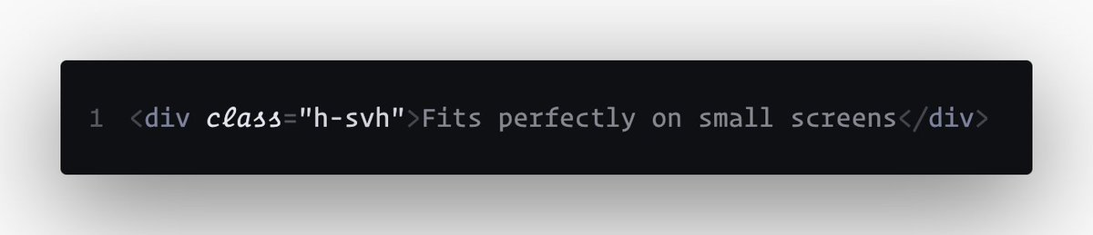
Small Screen Height (svh) ⏤ Makes things fit perfectly on smaller screens, like phones.
⏤ h-svh: Use this to make something fill the whole screen on small devices.
Large Screen Height (lvh) ⏤ Ensures things stretch out to fill the whole screen on bigger devices, like desktops.
⏤ h-lvh: This one makes sure something covers the entire screen on larger devices.

Dynamic Screen Height (dvh) ⏤ Adjusts the size to look right on any screen, big or small.
⏤ h-dvh: Adjusts automatically to make sure it looks good on any screen size.

Setting minimum and maximum heights
You can also set the smallest or biggest size you want something to be, making sure it always looks just right.
Imagine making a welcome section on your site that always fills the screen:
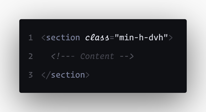
This makes sure your welcome message always has the impact you want, no matter the device.
- Can I use? https://caniuse.com/viewport-unit-variants. - ⏤ Yes!
Hope you like it and found it useful.
